Before I dive into some spectacular features of CSS3, let me say something about CSS attributes.
Apparently, the way CSS attributes should be sorted within a CSS class, is a much debated subject. Some people advocate sorting by functional category (in this case grouping first dimensions, then font attributes, then border attributes):
div {
  width: 10px;
  height: 10px;

  color: red;
  font-family: mono;

  border: 1px solid gold;
}
I prefer to sort alphabetically, because it is universal by nature in contrast to sorting by functional category. Of course you could specify an order if you sort by functional category, but that would introduce additional documentation overhead... So I would sort like this:
div {
  border: 1px solid gold;
  color: red;
  font-family: mono;
  height: 10px;
  width: 10px;
}
Although it doesn't really matter which way you sort, it's obviously a good idea to sort consistently within your project.
I make an exception for vendor prefixes. Vendor-prefixes are prefixes for CSS attributes that browser vendors (or manufacturers) use to implement non-standard (or not yet standard) CSS features. Take for example -moz-border-radius. The vendor prefix -moz is used by Mozilla (for Firefox obviously) and it is their implementation of the border-radius attribute. Once border-radius becomes standard, you can just use border-radius, without the prefix. Because of vendor prefixes, a typical block of CSS attributes might look like this:
div {
  border-radius: 10px;
  -moz-border-radius: 10px;
  -o-border-radius: 10px;
  -webkit-border-radius: 10px;
}
In this case, you might understand it to be wise not to sort the vender prefixes alphabetically, but to group them by attribute.
Adobe Flash and images are often used as a workaround for shortcomings of HTML (e.g. to compensate for what now can be done in HTML5 with the <video/> tag) and also for shortcomings for CSS. With CSS3 a lot of features have been added, so the use of images can be reduced even more. I'll give a couple of examples, so you can see for yourself (these examples where meticulously stolen from the presentation by Hakon Wium Lie).
background: green; border: 0.1em dotted blue;
text-shadow: 0px 0px 5px white;
border-radius: 40px;
border-radius: 150px / 50px;
box-shadow: 5px 5px 10px white;
box-shadow: 0px 0px 5px 3px green inset;
0px 0px 5px 3px red, 0px 0px 7px 5px green inset
This menu is an image on the Apple site, but pure CSS here:
You may also want to check out this wicked Opera logo fully in CSS.
Although before CSS3 there were some hacks to support custom fonts, now the use of Web Fonts has been standardized:
@font-face {
  font-family: WhiteRabbit;
  src: url(WhiteRabbit.ttf)
  format("truetype");
}You can see, I use this all around this site.
It's well known that long lengths of text are more readable when divided across columns, preventing excess horizontal eye movement. This could be solved by using a <table>, but everyone knows that tables are for tabular data, and this is why.
In CSS3 this can also be solved by using the column-width attribute. Unfortunately it is not widely supported yet (it doesn't work in Opera), so it is necessary to use vendor prefixes, e.g.:
-moz-column-width: 10em;
-moz-column-gap: 1em;
-moz-column-rule: 2px solid #fff;Although all kinds of easing of elements is available through a range of javascript libraries, this can also be implemented in pure CSS3 when limiting the events to those that can be defined by CSS, e.g. hover.
#transition {
  border: 2px dotted #fff;
  height: 20px;
  overflow: hidden;
  transition-duration: 1s;
  -o-transition-duration: 1s;
  width: 200px;
}
#transition:hover {
  height: 350px;
  width: 500px;
}
CSS Media Queries may be known from constructions to override CSS classes for certain media, e.g. printing or handheld devices, like:
<link type="text/css" media="all" href="default_style.css"/>
<link type="text/css" media="print" href="print_style.css"/>
The media type 'handheld' is not of much use anymore these days, because there is no standard resolution for handhelds anymore, if there ever was one.
A more advanced usage is available in CSS3, where conditions can be added to the query:
@media (max-width: 800px) {
  article {
    background: #5E72A2;
  }
}
In this case, when the max-width of the available space drops below 800px, the element 'article' gets another background color then when it would be larger than 800px. Try to resize this page below a width of 800px and see what happens. This can be used to reformat a page for handheld devices purely by using CSS.
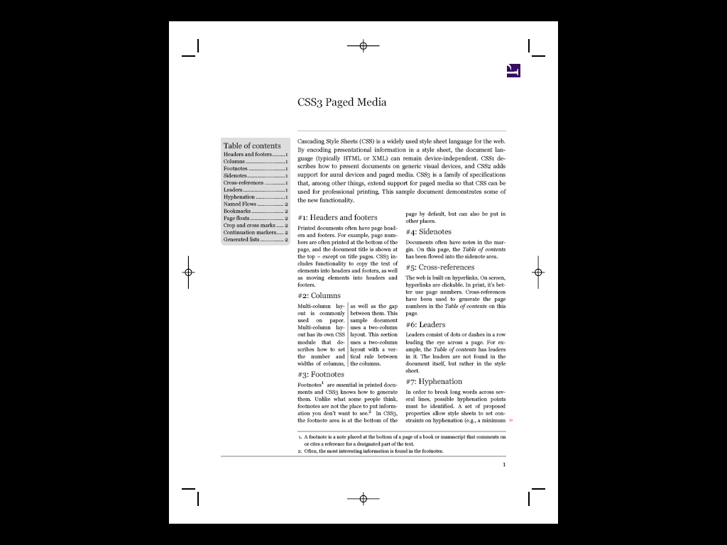
Using a separate CSS for printing is not uncommon, but this is an extreme example of how the CSS3 Paged Media module can be used to format a book. On a side note: I'm not under the impression that a lot of browsers support all of the CSS3 Paged Media functions.
The progressive nature of implementation of standards like CSS3 and HTML5 can make it quite difficult to keep track of what features can be used in what browser. This is where the use of the javascript library Modernizr becomes apparent. When included in your document it detects support for CSS and HTML5 features, amongst others. For example, when the browser has support for box-shadow, the CSS class .box-shadow is added to the document body element. That makes it possible to render differently if the CSS class is not available (source):
/* Simulated box shadow using borders: */
div.somediv {
  border-bottom: 1px solid #666;
  border-right: 1px solid #777;
}
.boxshadow div.somediv {
  border: none;
  box-shadow: #666 1px 1px 1px;
  -moz-box-shadow: #666 1px 1px 1px;
  -webkit-box-shadow: #666 1px 1px 1px;
}
This means you can essentially stop thinking about development on a browser level and concentrate on what features you would like to support. HTML5 and CSS3 features can be gradually integrated without losing support for older browsers.
You may also be interested in the related articles on html and javascript.